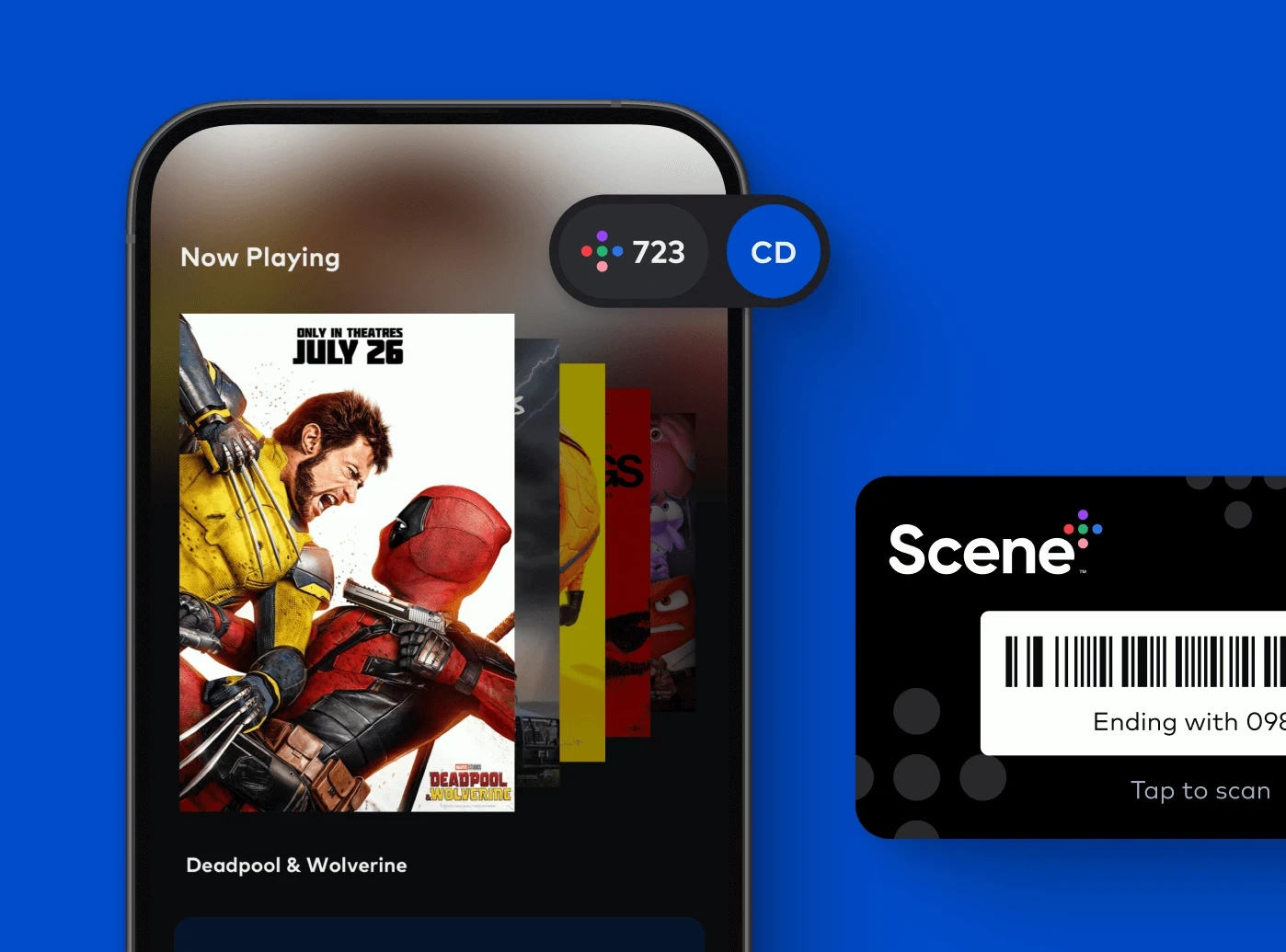
Cineplex
iOS
Android
POS

A UX journey through the Cineplex app redesign
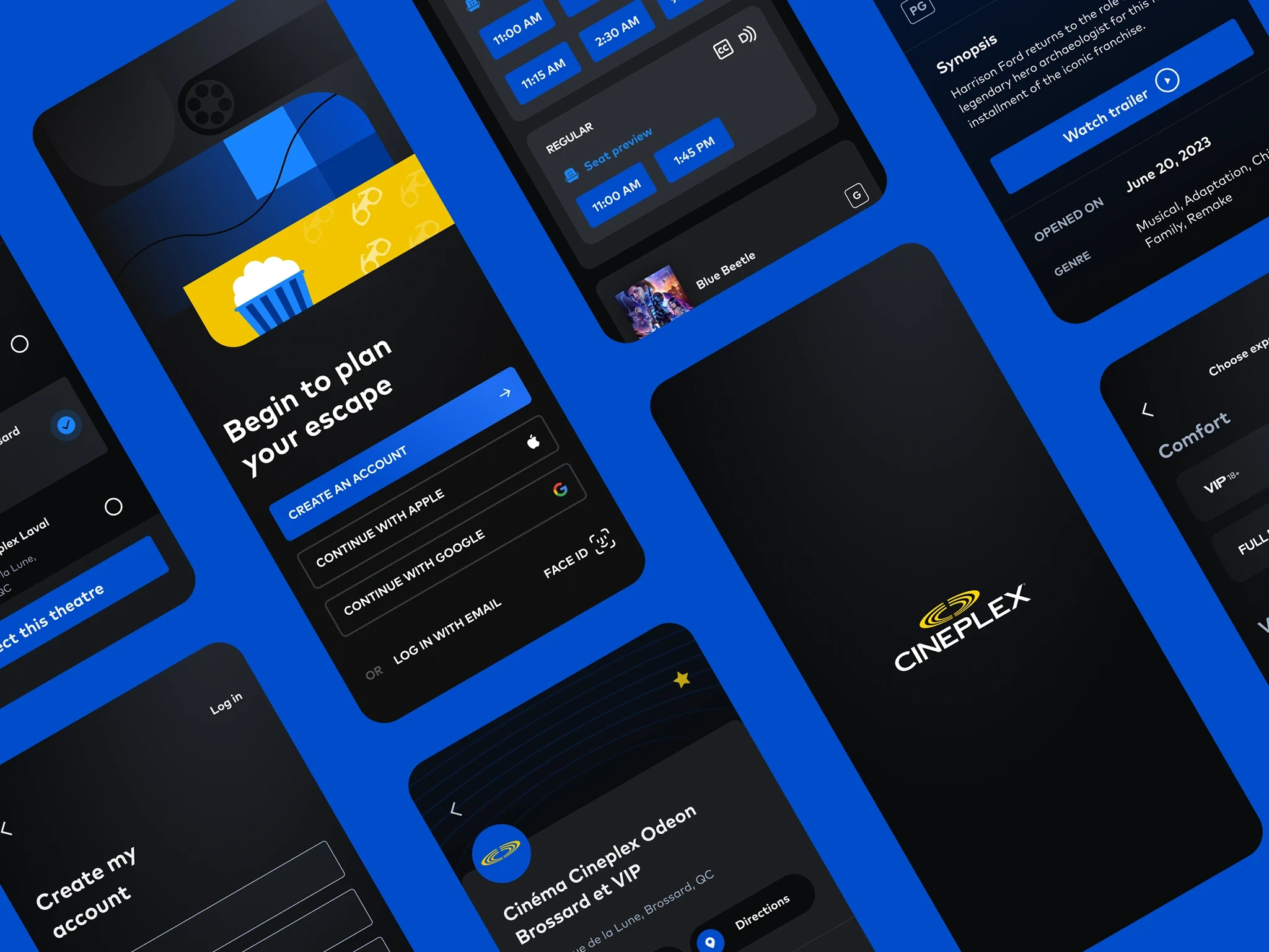
We kicked off the Cineplex app redesign with a focused discovery phase to align on user needs, business goals, and technical constraints. Through stakeholder workshops, we identified key user pain points: like friction in booking, navigation, and seat selection and explored how to better support core user journeys.
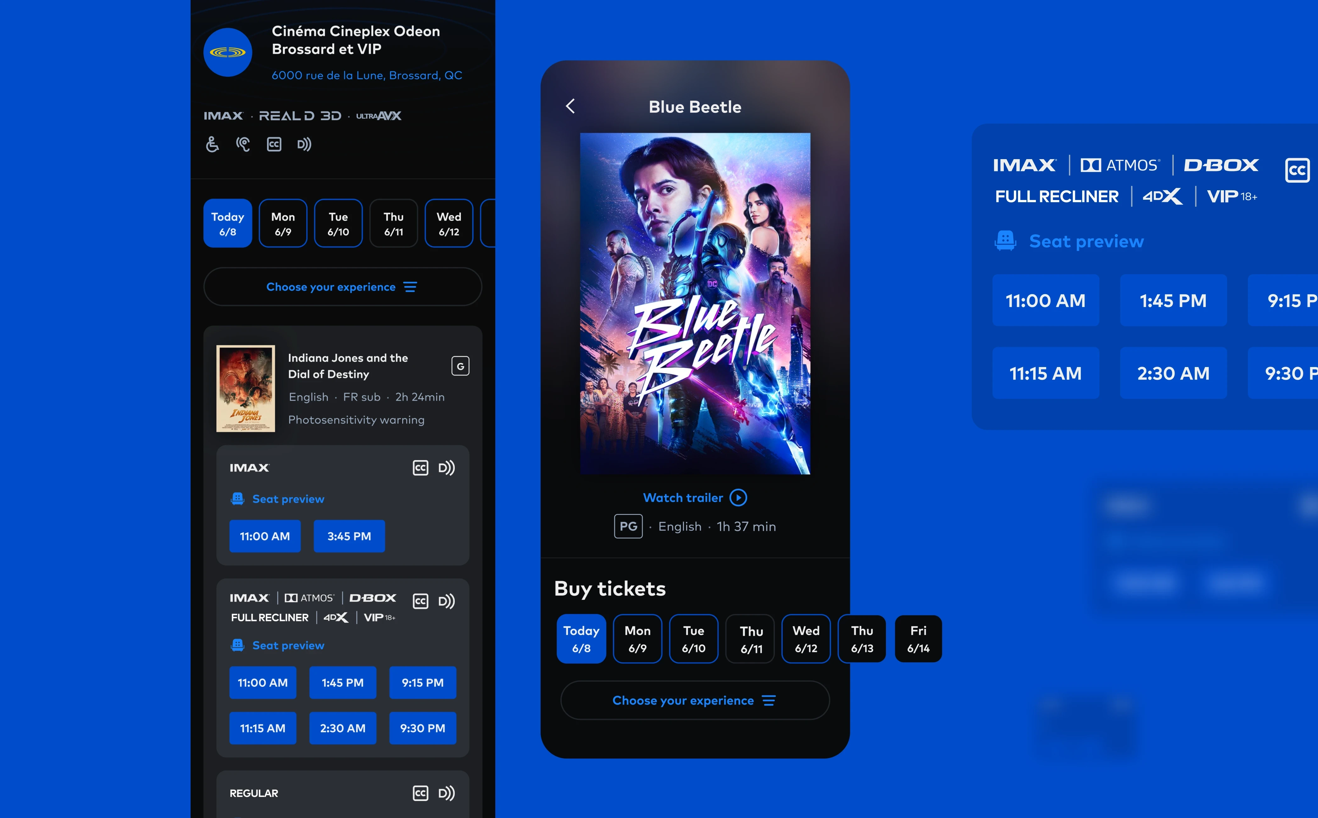
I collaborated closely with the Cineplex lead product designer to map user flows and explored wireframes that addressed key pain points in the movie ticket purchase experience. We bounced ideas back and forth, focusing on challenges like unclear theatre selection, confusing date and time pickers, and how to better inform users about movie formats such as IMAX, VIP+, and UltraAVX. This collaborative process helped us align quickly and design a more intuitive, error-resistant experience.
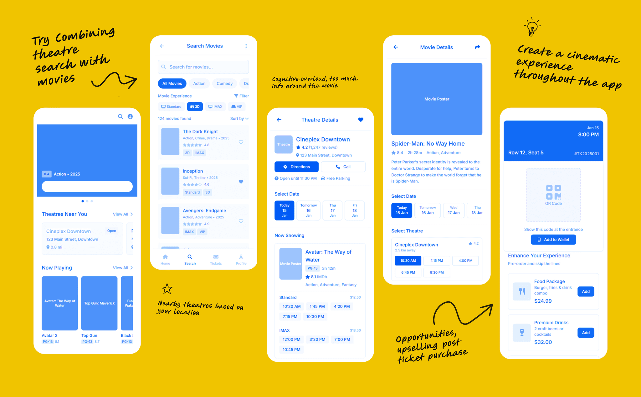
I also reviewed Cineplex’s brand direction and design system to identify opportunities for a more modern, platform-native experience. A prioritized feature list was built around personalization, faster checkout, and improved content discovery. Early collaboration with the dev team ensured all design decisions were technically feasible and scalable.
With goals aligned and user needs clarified, I had a strong foundation to move into problem solving.
Problem
Users often booked tickets at the wrong theatre, a common frustration in the previous app and website.
What seemed like a small UX flaw, unclear theatre selection, was causing real issues: missed showtimes, refund requests, and unnecessary customer support. To address this, I redesigned the onboarding flow to make theatre selection a priority. Instead of hiding it in settings, I brought it to the forefront, prompting users to set their preferred theatre right away using location-based suggestions.
Solution
Before users reached the home screen, we made sure they selected a “Go-to Theatre” during onboarding, giving the experience a meaningful piece of context from the very start. With that foundation in place, I reimagined the home screen as more than a functional launchpad. It needed to feel immersive, dynamic, and personal, while helping users discover what’s playing and get to a booking faster.
Using the selected theatre as a starting point, I designed a dynamic hero carousel that interacted with the background, bringing together rich cinematic visuals and subtle haptics for a more engaging, movie-like first impression. The experience could now feel relevant to the user from the moment they opened the app, rather than asking them to make those choices later in the journey.
Below the hero, I introduced scannable content rows organized around how people actually discover entertainment: new releases, coming soon, indie films, international cinema, live concerts, opera, documentaries, and the Cineplex Store. This gave the screen more depth without making it feel overwhelming.
The redesign also created opportunities to make the experience more useful beyond movie discovery. Contextual snack recommendations could surface combos, promotions, and pre-orders based on the user’s theatre and showtime, turning relevant upsells into helpful moments rather than interruptions.
The result was a home experience that connected discovery, personalization, booking, and concessions into one more cohesive journey, while giving Cineplex more meaningful opportunities to engage users throughout their visit.
Rating: 4.8 ★
The app redesign led to a noticeable improvement in user confidence and booking accuracy. Clearer theatre selection, streamlined date and time pickers, and well-labeled movie formats significantly reduced common user errors. The app saw increased engagement, smoother conversion flows, and positive feedback from both Cineplex stakeholders and users, validating the success of UX/UI decisions.